AI Boom or Dot-Com Repeat? The One Warning Sign That Flashed in 2000
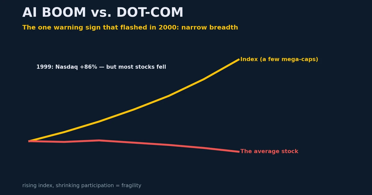
Every big rally invites the question: is this another dot-com bubble? The useful part of that comparison isn't whether prices are "too high" — it's a specific, observable pattern. Near the dot-com top, the headline index kept climbing while fewer and fewer stocks were actually participating. That divergence — a rising index on shrinking breadth — was the real tell. It's worth watching for in today's AI boom.
Note: Educational market commentary, not investment advice. Historical figures are approximate.
The dot-com tell: index up, breadth down
In 1999 the tech-heavy Nasdaq rose roughly 86% while the S&P 500 gained about 20% — yet underneath, more stocks fell than rose as investors dumped "old economy" names to crowd into internet stocks. Into the March 10, 2000 peak the split got extreme: the Nasdaq raced higher while the Dow Jones actually fell. The giveaway came on the way down — when tech finally cracked, money rotated so violently that the broad S&P could rise on a day the Nasdaq dropped. A 20%+ gap between the major US indices is rare; it has happened in only a handful of years (2000, 2003, 2009). Months later, the Nasdaq was down about 78%.
Then vs. now
| Dot-com (late 1990s) | AI boom (today) | |
|---|---|---|
| What's leading | A handful of internet/telecom names | A handful of AI mega-caps & chipmakers |
| Breadth | Negative even in 1999 — most stocks fell | The key thing to monitor now |
| Quality of leaders | Often little profit; many later delisted | Real profits & cash flow (a genuine difference) |
| Implication | Crashed ~78% | Higher-quality leaders could run longer — but aren't exempt from the breadth lesson |
The honest takeaway cuts both ways: because today's leaders actually earn money (unlike many 1999 names that no longer exist), the rally could run further than skeptics expect — but "the price ran ahead of even great companies, then corrected hard" is a pattern that's tough to escape entirely.
Breadth signals worth watching
The clearest signals come not from the leaders — they're too strong to wobble — but from the periphery: the parts of the market farthest from AI. Think of it as a rear-view mirror.
| Watch for… | Why it's a caution flag |
|---|---|
| Only AI / mega-cap names (or just the Nasdaq) rising while the Dow, the equal-weight S&P, and small caps lag or fall | The rally rests on a few stocks; a stumble in them hits the whole index |
| The index at new highs but fewer stocks making new highs | Participation is shrinking under the surface |
| Only a few countries up (e.g. US, Taiwan, Korea) while most global markets are flat-to-down | The move is concentrated, not a broad global expansion |
The extreme version — when only the handful of leaders are green and almost everything else is red — is what tends to mark the late innings. We're not obviously there yet; most global markets are still rising. Narrow breadth isn't a precise timing tool (markets can stay narrow a long time) — it's a fragility gauge. The reassuring counter-signal is the opposite: a rally that broadens out, with more stocks, sectors, and countries joining, tends to be healthier and last longer.
Check it yourself: in the simulator, put a few AI leaders against the broad S&P 500 in Compare mode. A widening gap between the leaders and the index is exactly the concentration this post is about.