Reading Stock Charts Will Put You on a Different Path as an Investor — Start With These 6 Signals
Many investors treat charts as something only day traders bother with. In practice, every serious investor looks at charts — they provide no magic signals by themselves, but they compress months or years of price history into a single image. A quick glance tells you whether a stock has been rising, falling, or stuck sideways; whether a major price level is approaching; and whether a potential entry point is early or late in a move.
This guide covers the foundational concepts: how to read a candlestick, what support and resistance mean, the three trend states a stock can be in, how moving averages help you see those trends, three signals that often mark the start of a new uptrend, and two candlestick patterns worth recognizing. All charts here follow the U.S. convention — green for a session that closed higher, red for one that closed lower.
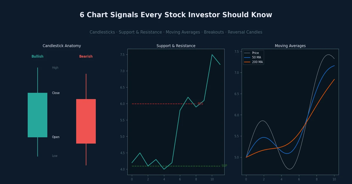
1. The Candlestick
A single candlestick summarizes all the price action in one period — one day, one week, or one month — in four numbers: the open, the high, the low, and the close. The rectangular "body" spans the open to the close. Thin lines called "wicks" or "shadows" extend above and below the body to show the highest and lowest prices touched during that period.
A green (bullish) candle means price closed higher than it opened — buyers won the session. A red (bearish) candle means price closed lower than it opened — sellers won. The color and body size give an instant read on conviction: a tall green body with tiny wicks means buyers were in control all day; a small body with long wicks means the session was contested and indecisive.
Fig. 1 — U.S.-style candlestick anatomy. Green = closed higher than it opened (bullish). Red = closed lower (bearish). The body spans Open to Close; wicks show the High and Low of the session.
One detail worth noting: where the close falls within the day's range tells you a lot. A green candle where the close is near the session high — with little or no upper wick — means buyers dominated all day without any meaningful pushback from sellers. That is a much stronger signal than a green candle where the close is near the middle of the day's range, which shows sellers reclaimed some of the gains before the bell.
2. Support and Resistance
Price does not move randomly across every level equally. At certain prices, buying interest repeatedly appears and stops a decline — that floor is called support. At other prices, selling pressure repeatedly caps advances — that ceiling is called resistance. These levels exist because large groups of investors made decisions at those prices: people who bought near support want to add more at the same level; people who are stuck at resistance want to sell and break even.
Fig. 2 — Price bounces between a resistance ceiling (red dashed) and a support floor (green dashed). Circles mark the turning points; arrows show the direction of the bounce.
Support and resistance can switch roles. When price breaks convincingly through a resistance level, that level often becomes the new support on any later pullback — buyers who missed the breakout now step in at the former resistance. Conversely, a support level that breaks becomes overhead resistance from below. This "role reversal" is one of the most consistent concepts in chart reading and helps explain why certain round-number price levels are watched so closely.
3. The Three Trend States
At any given moment a stock is in one of three states: an uptrend, a downtrend, or a sideways consolidation. Identifying which state applies to the stock you are watching is the single most important judgment a chart reader makes.
An uptrend is defined by a sequence of higher highs and higher lows — each rally peak exceeds the last, and each pullback holds above the prior pullback low. A downtrend is the mirror: lower highs and lower lows. A sideways (consolidating) market exists when neither buyers nor sellers can push price beyond a defined range. You can draw a trendline connecting the lows in an uptrend (upward sloping) or the highs in a downtrend (downward sloping) to see the structure clearly.
Fig. 3 — Three trend states. HH = Higher High, HL = Higher Low (uptrend); R/S = Resistance/Support (sideways); LH = Lower High, LL = Lower Low (downtrend). Dashed lines are trendlines.
The practical implication is straightforward. Buying a stock in a clear downtrend — without a confirmed reversal signal — means fighting the prevailing momentum and the expectations of every other market participant watching the same chart. Sideways periods are neutral: the stock is "deciding" its next direction. The goal is to identify a stock transitioning from sideways or downtrend into an uptrend, as early as the evidence allows.
4. Moving Averages — the 50-Day and 200-Day
A moving average smooths out daily price noise into a cleaner trend line. The 50-day moving average (50MA) is the average closing price over the past 50 trading sessions — roughly three months of data. The 200-day moving average (200MA) covers approximately a full year. Both lines are standard on Bloomberg terminals and U.S. charting platforms, which matters: when enough investors watch the same line, price tends to react to it — a self-reinforcing effect sometimes called a "self-fulfilling prophecy."
The general health check: when price is above its 200MA and the 50MA is above the 200MA, the stock is in a structurally sound uptrend. When both are violated, the trend has deteriorated. The 50MA reacts faster to recent price changes; the 200MA is the deeper, slower anchor of long-term direction.
Fig. 4 — Price (gray) is the most volatile line. The 50-day MA (blue dashed) reacts faster to recent changes. The 200-day MA (orange) is the long-term structural trend anchor.
A widely watched crossover: when the 50MA crosses above the 200MA it is called a "golden cross," often cited as a long-term bullish confirmation. The reverse — 50MA crossing below the 200MA — is the "death cross," a bearish signal. These are lagging indicators (they confirm a trend change after it has already occurred), but they are useful checkpoints for portfolio allocation decisions.
5. Three Signals That a New Uptrend May Be Starting
Knowing the trend is only half the work. Identifying the moment a new uptrend begins — rather than buying well into it — is where charts provide the most actionable value. Three patterns consistently mark potential inflection points.
Box breakout. When a stock consolidates in a tight price range for weeks or months, the market is in a waiting period — no strong reason to buy or sell at scale. If a catalyst appears (strong earnings, a product announcement, a macro shift), price can break sharply above the top of that range. The longer the consolidation, the more significant the breakout tends to be, because a wider base means more investors have been watching and waiting. The ideal breakout candle is green, unusually large relative to recent sessions, and accompanied by above-average volume — all three together signal broad market consensus that the stock should be priced higher.
Fig. 5 — A box breakout: price consolidates in a range, then breaks above on a large green candle with elevated volume. The former resistance level (blue dashed) typically becomes new support.
Breaking a downtrend line. When a stock has been declining, you can connect successive lower highs with a straight line — that is the downtrend line. When price closes convincingly above it, the downtrend's structure has been broken. This does not guarantee an immediate powerful rally, but it removes one of the strongest arguments for staying out. Confirm with candle size and volume, as with a box breakout.
All-time high or prior-cycle high breakout. When a stock trades above its previous all-time high, it has cleared every single seller who ever owned the stock. There is no overhead "supply" from investors waiting to break even — the entire shareholder base consists of people who bought below the current price and are sitting on a gain. These tend to be the cleanest setups because there is no historical anchor pulling price back. The market analyst term for the trapped sellers below a major peak is "overhead supply" or "supply zone" (매물대 in Korean market terminology). When that zone is fully absorbed and price breaks clear, the composition of shareholders resets entirely — the stock effectively has a fresh start.
6. Two Candlestick Patterns Worth Knowing
Within any trend, individual candle shapes can alert you to momentum shifts before they fully confirm. Two patterns are especially worth recognizing at a glance.
Fig. 6 — Left: a long bullish candle where the close equals the session high — buyers dominated all day with no meaningful selling into the close. Right: a hammer — sellers pushed price far down intraday, but buyers absorbed all of it and forced the close back near the open, signaling potential trend reversal.
The long bullish candle — especially when the close equals or nearly equals the session high with little or no upper wick — signals that buyers were in charge from open to close with no significant pushback. When this pattern appears at a key breakout level (box top, downtrend line, prior high) with volume well above average, it is considered a strong confirmation signal. The combination of a large body, close near the high, and high volume is sometimes called a "close-high long candle" and is one of the cleaner signals in chart analysis.
The hammer has a small body near the top of the session's range and a very long lower wick — typically at least two to three times the body length. It forms when sellers push price aggressively lower intraday, but buyers step in at lower levels in sufficient size to drive price back up to near the open. The long lower wick is the visual evidence of that buying. A hammer is most meaningful after a sustained decline, appearing near a support level, because it suggests the floor may be holding and momentum could be reversing. Like all candle patterns, it carries more weight with above-average volume.
Putting It All Together
Chart reading works best as a top-down process. Start with the longer time frame — monthly or weekly — to identify the trend state and any major support or resistance levels. Then move to the daily chart and check whether price is above the 50MA and 200MA. Look for the three buy signals: is a box consolidation forming, or has a breakout just occurred? Is a downtrend line being challenged or broken? Is a previous major high being cleared? Finally, examine individual candles at decision points: are you seeing large green bodies closing near the high on elevated volume?
None of these signals are guarantees. Every pattern can fail; a breakout can reverse; a hammer can precede more selling. Charts describe what has happened and give probabilistic context, not certainties. But used alongside fundamental research — understanding what a company does, how its earnings and cash flow are trending, whether its valuation is reasonable — chart reading helps you time entries and size positions more thoughtfully than guesswork alone allows.
To see how these price structures have played out historically, the Stock Investment Simulator on this site lets you load monthly closing data for TSLA, NVDA, AMD, the S&P 500, KOSPI, and more. Selecting different date ranges lets you zoom in on specific uptrends, consolidations, or crash periods and observe the price action that accompanied them.
This article is for educational purposes only and does not constitute investment advice.